Joe Timbs
We caught up with Berlin-based creative producer Joe Timbs to talk about his path into production, the tools and techniques that keep his projects running smoothly, and the incredible amount of coordination behind one of his most ambitious jobs to date: the Zalando x Adidas A to Z of Fashion campaign film. From childhood inspiration to collaborative workflows and 16mm film, Joe offers an insightful look behind the scenes of contemporary production, where creativity meets logistics at scale. BTS photography by @alexkibb

Hey Joe! Thanks for taking the time to chat today. Let's start off by talking about your background and how you got into production.
So I've always had a love for cinema and the filmmaking process. I remember as a kid I used to watch the behind-the-scenes videos that you'd get as DVD extras and I just loved peeking behind the curtain to see how things were made.
And so when I had the opportunity to study filmmaking at University I leapt at the opportunity. While I was studying I was also fortunate to work with a number of extremely talented directors, DOPs and filmmakers and so was really learning by being hands-on in the production world. This really propelled me forward into the production world.

Love that 90’s nostalgia, how great were those DVD behind-the-scenes extras! So can you walk us through your typical process when it comes to producing a project from ideation to execution. Generally speaking are there any methodologies or tools you consistently rely on?
I always try to work as closely with the creative team as possible, whether that be an internal creative team or an agency creative team. Really try to understand the essence of the idea, the purpose of the messaging and how nuanced that message is.
Is it meant to be clever? Is it humorous? Is it tongue-in-cheek? Is it direct? Is it emotional? Understanding what the tonality of the idea is.
From there you can look at who fits best as the director, DoP and photography plus all the heads of departments that you'll be working with. It’s not necessarily about finding someone who’s produced work that's the exact same, it’s about finding someone who shares that tonality you’re trying to convey.

Tools-wise, I've started to use milanote This is an organizational software tool, very similar to Notion, where you can place all the information for the project. So mood boards, budgets, links to creative decks, crew lists, research documents for locations, for casting, for styling, for anything and everything. You can store it all in one place. So I've started to use that. It's really handy to have everything in one singular place rather than across multiple emails, documents, drive links, etc.
That sounds so handy for keeping the creative team tightly aligned, especially across a project like this with so many moving parts. Speaking of, let’s dive into it, can you give us a short synopsis of ‘Adidas A-Z’?
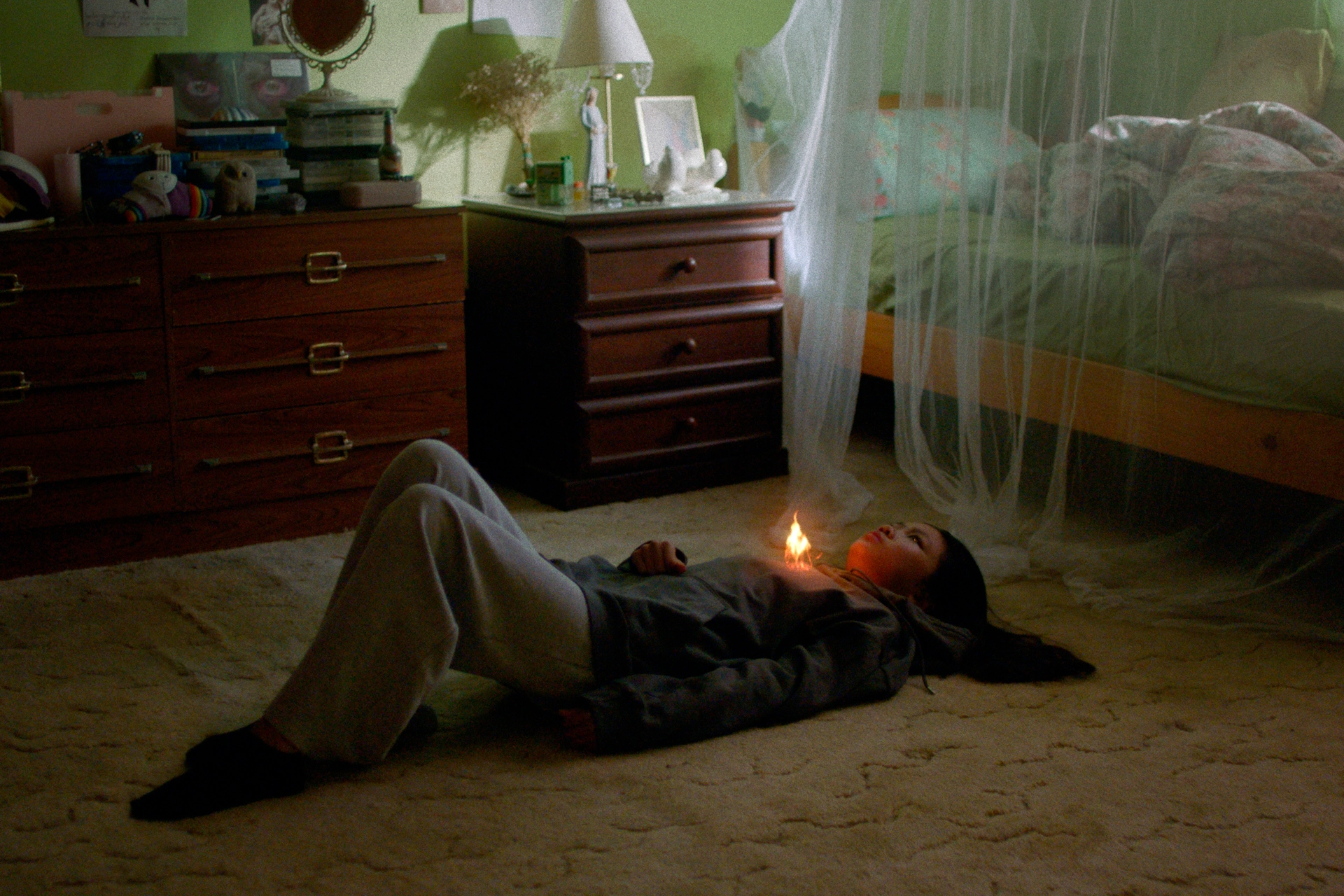
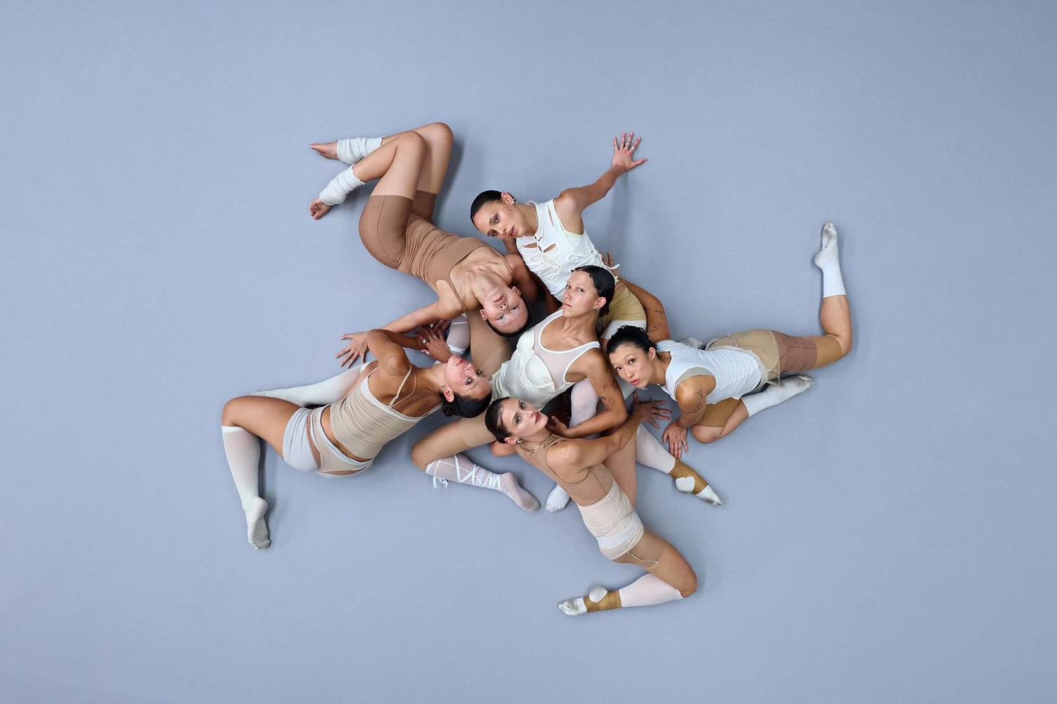
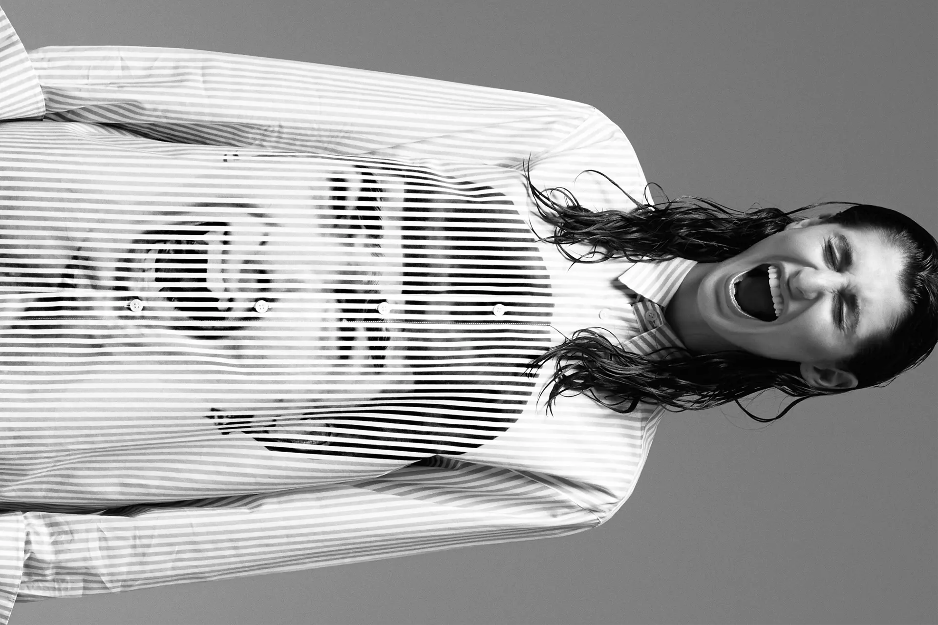
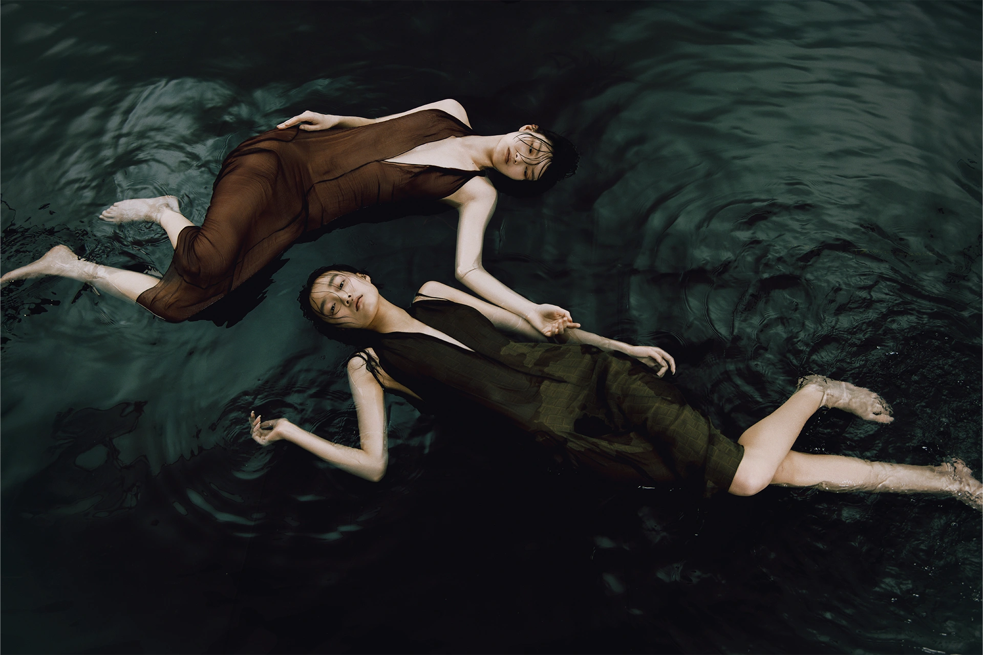
The project, Adidas A-Z, explores 26 fashion cores, one for each letter of the alphabet. We created custom backgrounds for each of the cores and matched the styling, hair and makeup for each core. In essence every letter of the alphabet became a new ‘scene’, complete with unique lighting, styling and title design.

Was Jason Yan-Francis always set to direct? Can you share any insights into working with Jason and his process?
For this project, we had a creative brief that we pitched out to three directors, each bringing their interpretations of the concept. Jason (@jason_yan_francis) is well known, at least in Europe, for his seamless transitions and making them a centerpiece of his work. His treatment for this project was by far the most thorough, going into great detail for every letter of the alphabet. Jason had a clear vision for the visual aesthetic and numerous suggestions for each core.
He stood out above the other two directors, and we ultimately chose him. In terms of his process, he was very collaborative. We had a lot of back and forth on the specific fashion core for each letter.
Adidas wanted certain letters to portray particular streetwear aesthetics they had been known for in the past, creating a historical connection.
We worked with Jason to refine his treatment into a story that met both the client's and his creative needs. With many moving parts and creative decisions to make along the way, it was a constant collaborative approach with Jason to refine the idea right up until the shoot day.

Were there any specific influences from film, photography, music or art that played a significant role in shaping the concept?
We looked a lot at past Adidas campaigns and also cultural fashion movements/trends to see how they could match. From there the main inspiration came from the fashion cores - some were super self explanatory for example Logo Core and Tennis Core - while others allowed for a more creative approach such as Kid Core.
There looks to have been a lot of moving parts to coordinate with so many sets to design and looks to create. How long did you spend in pre-production?
For this project, we had about four weeks of solid pre-production. The project itself ran for much longer, but once Jason was signed on, we focused on four weeks of intensive preparation. Clear communication across all heads of department was crucial due to the many moving parts involved.
A significant portion of the pre-production effort involved the creation of the background screens. We found a great post house (@cactusdigital) to handle the backgrounds and ensure they were ready before the shoot. We had to build in several feedback loops for the screens with the creative team and the client which meant working over the weekends.We were also super conscious of the fact that various elements such as styling, hair and makeup, and casting all had to work in tandem so there were lots of alignment calls to ensure everyone was working towards the same goal. Thinking back to it now there were so so many pieces of the puzzle to coordinate.
What were some of the biggest hurdles and challenges you faced? And how did you manage them?
The biggest challenge was coordinating so many different creative elements, from casting and styling to screen creation and camera movement.
Every detail needed to work seamlessly for the whole project to succeed, and I was aware of this from the beginning. To manage this, I created a comprehensive spreadsheet that included each letter, the names of the fashion pieces, the models, the looks, the hair and makeup, the backgrounds, the main colors, and all the styling details.
This spreadsheet became our "Bible" for each letter and fashion core, allowing us to have an overview whenever we spoke to anyone coming into the project. The overwhelming amount of detail for each fashion core and theme was probably the biggest hurdle, but this detailed organization helped manage it effectively.
Love that, what other considerations did you take to ensure the days ran as smoothly as possible?
With the spreadsheet ‘bible’, I sat with the first AD and we cut out strips of paper for each letter, including all the relevant information. We considered the availability of our talent and split them between day one and day two based on their availability. This allowed us to determine which cores/letters we were to shoot on which days. We then collaborated with our hair and makeup artist to determine the most efficient shooting order based on the associated looks. These considerations helped us refine the shooting schedule.
On the two shoot days, we had a first AD running the film set, a second AD running the photo set, and a third AD managing hair and makeup. For any project of this complexity, I can highly recommend having as many ADs as you can afford, they are invaluable and made the day function smoothly. We didn't go over time at all on this production, which was a significant accomplishment.
What was the thought process behind the lighting, equipment, and set choices? Were there any special considerations to take into account when shooting on 16mm film or with the Technocrane?
As we had an LED back wall to showcase the different customs screens, we were very conscious that this LED wall would emit a high amount of light, so the surrounding lights needed to match its output. This gave us a benchmark for the light output required, and our gaffer, Benjamin Erdenger (@ben.erdenberger), was able to put together a very specific equipment list that covered our bases. You can see the setup in the lighting plan image below.
Additionally, everything was set up on a DMX control board to easily switch between the different scene settings. Benjamin and his DMX board operator, Falk Buchröder, spent the pre-light day pre-programming as many lighting looks as possible, creating specific presets for each letter/fashion core. This made it quicker on the shoot day, as only minor adjustments were required.

We also had to consider the moiré effect that occurs when shooting with an LED screen background. As LED screens have improved over the years, the pixel pitch (the distance between each LED pixel) becomes smaller, but rental costs increase. We needed to balance pixel pitch size and cost, being aware that shooting digital on LED screens can cause a moiré effect. I'll include a BTS photo below to illustrate this. Shooting on 16mm film was a decision made for both stylistic and practical reasons. Film cameras have less of a moiré effect than digital cameras, which influenced our decision. The Technocrane allowed us to leave the camera attached to one piece of equipment while still being able to get multiple angles quickly. It provided flexibility for panning shots, dolly shots, push-ins, and up-and-down shots.
What was the workflow for post-production? Did you run into challenges there?
The post-production workflow involved a lot of online editing. So we knew the offline edit would look quite rudimentary compared to the online version. Therefore we collaborated with an editor who had worked with Jason numerous times, confident in his ability to translate Jason's vision into a cohesive edit while managing client and creative teams expectations. The editor was able to create a longer edit that incorporated all the A-Zs in a fluid manner. After approving this master version, we moved on to the cut-downs, knowing they would be a patchwork of different scenes that still needed to flow seamlessly. The editor did an excellent job with this. Our post-production partner Orage Studios (@orage_studio) jumped into the online edit which required significant compositing and retouching. They were highly motivated to see the project through to the best of their ability, even with a short turnaround time and a lengthy process. Final touches involved title creation by (@beyasheva) and music composition by Ant Pablos (@hawn).

One huge challenge was that the offline edit was done using proxy scans, and once we had the picture locked we sent a request to the Lab to rescan the rolls at 4K scans of the film.
Unfortunately, once we received the 4k scans the Lab had not included any meta data or timings to easily relink the footage. The assistant editor then had to manually re-sync the scans from the proxies to the online edit. This was unknown to us initially and wasn't accounted for in our timeline, resulting in an extra one or two days of work for our assistant editor. However, huge props to Orage for handling this challenge effectively and efficiently.
Anything else you would like to add?
I'm incredibly proud of this project. It was a lot of work with many moving parts from beginning to end. There was a lot to figure out, and I found it really beneficial to visualise the project by having everything in one place, in this case a spreadsheet with all the different pieces collected into one source. Onboarding different crew members and showing them the overview for what the project was about was much easier than verbally explaining it without references. I'm really glad I took the time from the beginning to collect everything into one place.
There were also many learning experiences, especially with some post-production work in the lead-up to the shoot involving screen creations. In pre-production, you're often still refining the idea, and many changes happen along the way.
You don't always think about how these affect the overall creative vision of the film. With our short pre-production time, we had to make creative decisions that would have a ripple effect in the project. It was a lot of work, but I'm glad we did it. I was able to work with some really talented individuals on this. The title design was incredible, and Jacob, another VFX artist, came in to comp the title names into the film. We had incredible music composition by Ant, which brought the project to life. It was a really collaborative process, and I'm super happy with the outcome!
